Charts: Test your skills >> Excel Skills For Business: Essential
1. Creating charts is pretty straightforward but it’s important we know the terminology Excel uses. What is the Chart Area?
- The chart area is the entire chart with all of its elements.
- A worksheet in the workbook that only contains one chart.
- The chart area is the part of the chart that displays the data visualization.
2. Creating charts is pretty straightforward but it’s important we know the terminology Excel uses. What is the Plot Area?
- The plot area contains all the information about the data source underneath the horizontal axis.
- The plot area is the part of the chart that displays the data visualization. It is located in the area framed by the y and x axis.
- The plot area refers to the values from cells on your worksheet.
3. Creating charts is pretty straightforward but it’s important we know the terminology Excel uses. What is meant by the word Legend?
- The legend is the explanation next to each of the axis.
- This is not a valid term relating to Charts.
- The legend decodes the data labels and adds explanation to the chart.
4. When you want to create a chart, what do you need to observe?
Multiple answers are possible, partial credit will be awarded.
- Carefully select all the data you want to include in the chart.
- Select any headings in rows and/or columns.
- Ensure that your selection doesn’t contain any empty rows or columns.
5. Download the workbook below. It contains a slightly altered and abbreviated version of the FBI Crime Statistics, 1994-2013. You will need to work with it in order to answer the next questions in this assignment.
W06-workbook.xlsx
You have been given the task to provide some visual summaries to support a presentation on trends and volume of certain types of crime in the United States. Take a moment to familiarize yourself with the workbook. What is the title of Table 1?
- Crime in the USA – FBI Data
- Crime in the United States by Volume, 1994-2013
- Crime in the United States
6. Take a look at the screenshot below and then head over to Excel to your W06-workbook file. Which cell ranges were selected to create this chart?
- B5:B9
- A5:B9
- A4:B9
- A1:B9
7. Take a look at the screenshot below. What type of chart is this?
If you are unsure, go over to Excel and have a play with the different chart types to figure out which one we are seeing here.
- A clustered bar chart.
- A scatter chart.
- A line chart.
- A trendline chart.
8. Take a look at the chart below. What’s missing from this chart to make it a useful visualization for a presentation on Violent Crime rates between 1994-2013?
Multiple answers are possible, partial credit will be awarded.
- There are no gridlines.
- The x-axis information is missing.
- The y-axis information is missing.
- The chart title is meaningless.
- There is no legend to explain the value category.
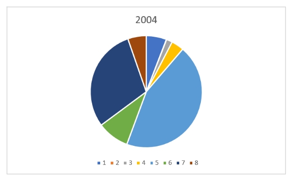
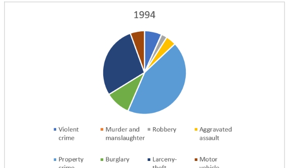
9. Using the data in the W06-workbook, create a 2-D Pie Chart for 2004, including labels. Which of the following best represents what you have created?
- This:
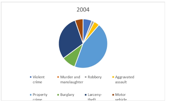
- This:
- This:

- This:
- This:

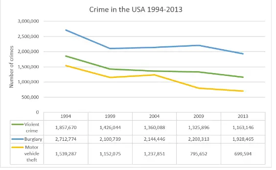
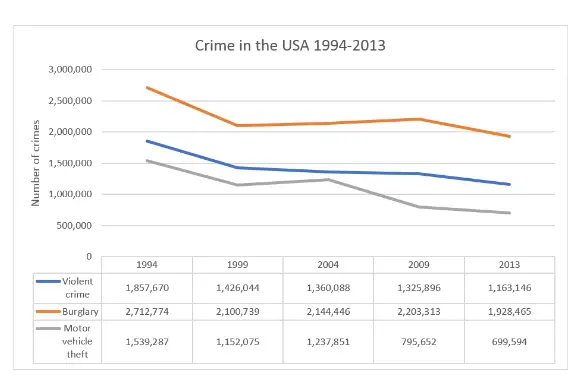
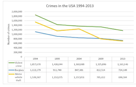
10. Create a Line Chart for Violent crime, Burglary and Motor vehicle theft. Use the Quick Layout to show the data table below the chart (hint: hover over the Quick Layout options to find which one includes a data table). Change the colors so that Violent crime is green, Burglary is blue and Motor vehicle theft is yellow. Change the chart title to Crime in the USA 1994-2013. Change the vertical axis label to be Number of crimes.
Which of the following does your chart most closely resemble?
- This:

- This:
- This:
- This: